Designing & Researching for Social Good
UX Designer + User Experience Researcher // Google UX Professional Certificate // Feb. 2023 - April 2023
As part of the Google UX Professional certificate, I was tasked with designing a mobile app and responsive website “for the social good.” The ability to read and write is fundamental to self-actualization and personal growth, so I met this design challenge by creating Book Bots, an affordable literacy-based instructional app and mobile site for my users: parents, teachers and emergent readers (aged 4-7).
CHALLENGE: Parents and teachers of young children want an affordable way to supplement their children’s reading instruction outside of the classroom.
SOLUTION: To design a fun, free and easy-to-use app that teaches emergent readers phonemic awareness, and a responsive website that incorporates game play for children and information about Book Bots’ methodology and curriculum for parents.
EMPATHIZING WITH USERS
To truly understand Book Bots target users, I engaged parents, teachers and young children (aged 4-7) in conversation about their experiences with technological solutions that are intended to enhance learning. The following questions helped me to uncover their needs, motivations and behaviors:
What apps/websites do you currently use at school, home and/or in a public setting like a library?
What features/characteristics are you looking for in a free, digital literacy program? What features/characteristics would bring your young readers the most delight?
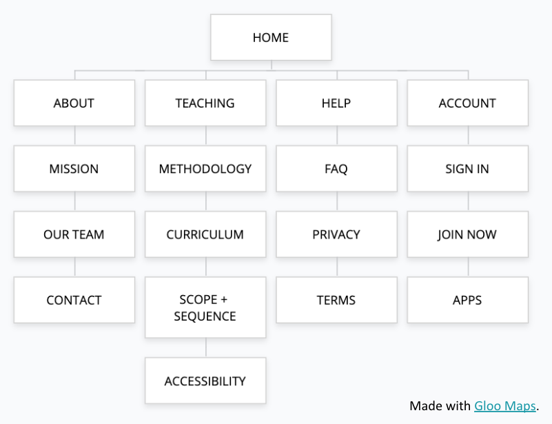
What would a developmentally-appropriate information architecture and navigation system need to include?
How can we utilize accessibility and inclusive design practices to design for students with special needs and for students who are learning English?
DEFINING THE PROBLEM
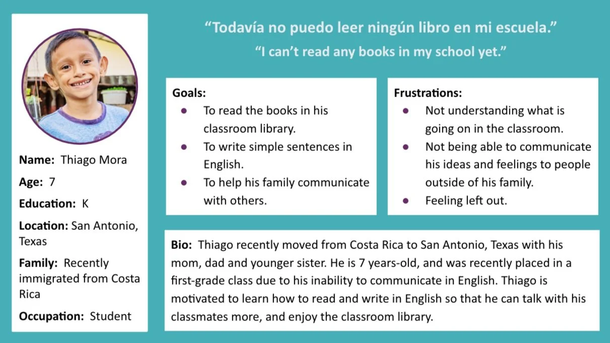
Interviewing people from each of the user groups helped me to understand the different and sometimes overlapping needs and motivations of parents, teachers and emergent readers.
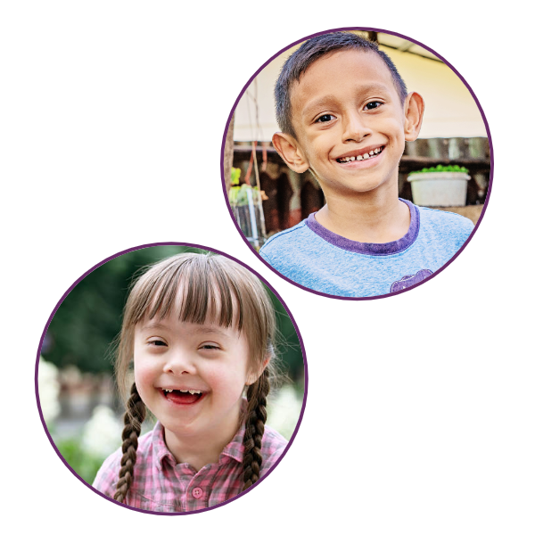
Defining the problem really forced me to understand what Ella and Thiago’s user journeys would be like, and what kinds of paint points and pleasure points they would encounter as they sought out and engaged in using a literacy-based application as a mother of a child with special needs or a young man whose first language is Spanish. You can check out their user journeys here.


IDEATING POSSIBLE SOLUTIONS
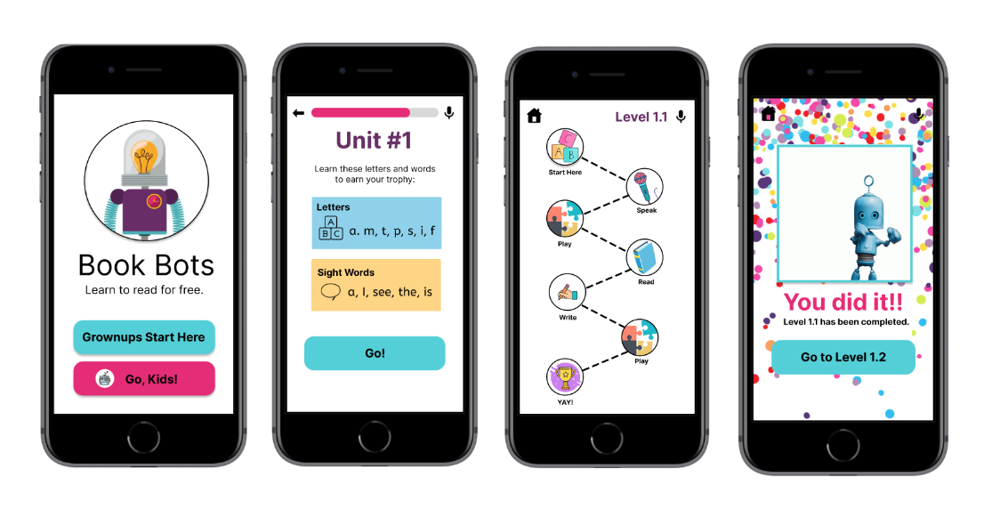
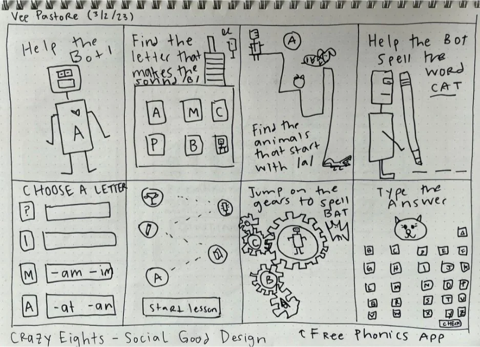
Before I could begin designing a dedicated mobile app for young children, it was really important for me to imagine what game play might be like for them on a mobile devices. To sketch out some ideas, I used the “Crazy Eights” strategy (bottom left). Following this exercise, I decided that I wanted the literacy-based app to have a robot theme. I have always loved robots, and I knew kids would, too!
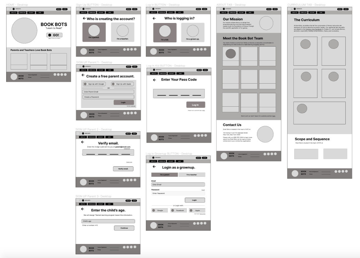
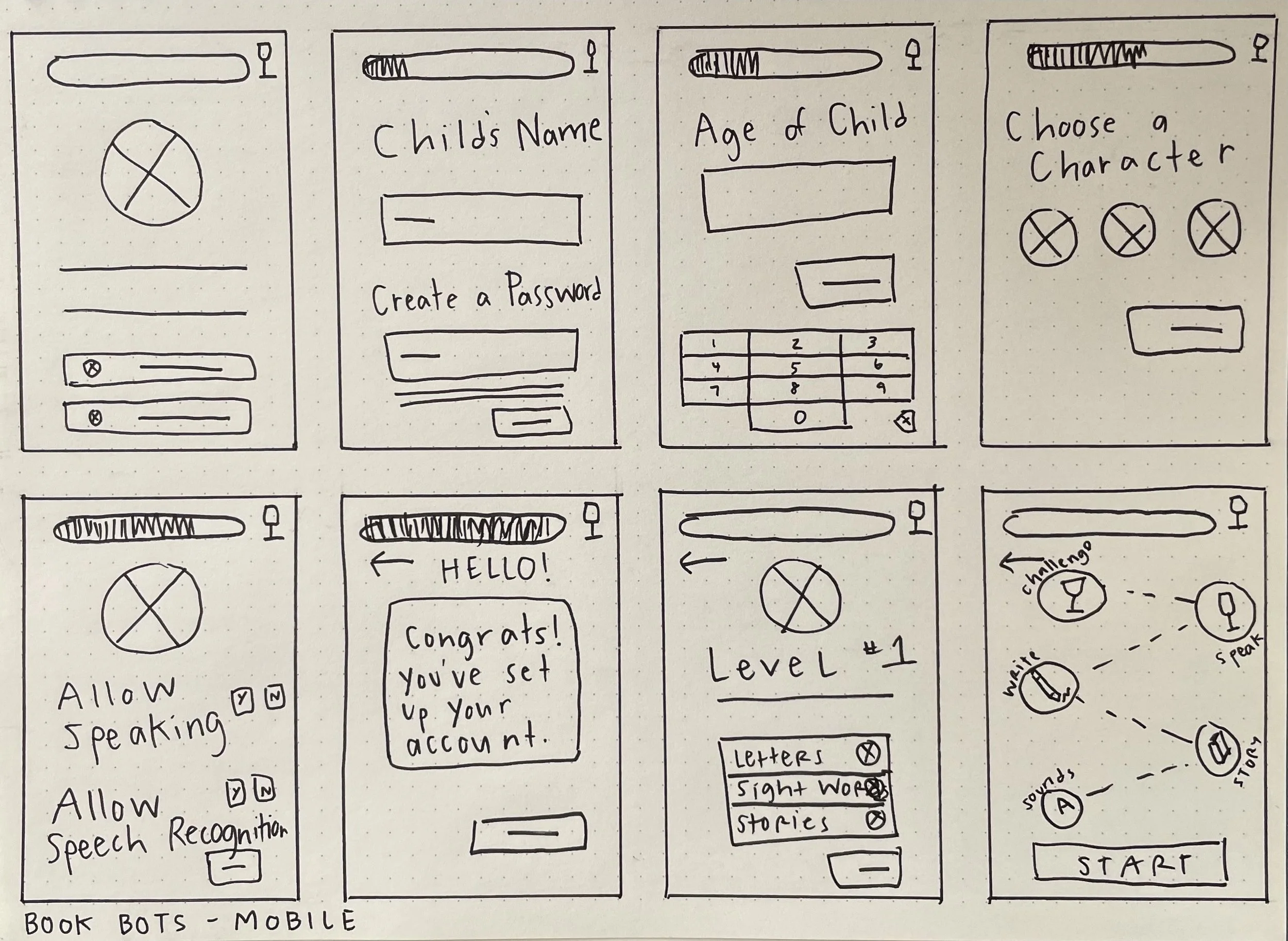
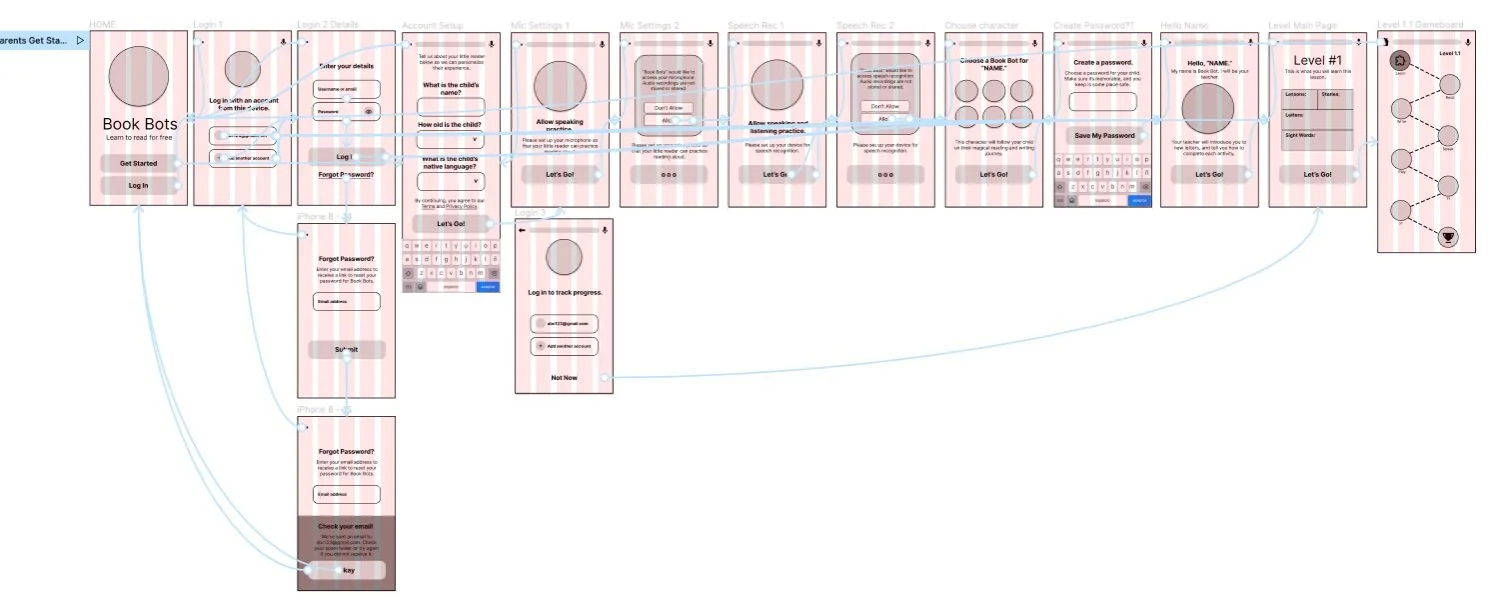
Though the app is intended for young kids, parents and teachers would be required for the account setup. I found this part to of the design process to be the most challenging — creating a smooth process onboarding for adults, and a seamless transition to instant play for kids. As you can see from my paper wireframes (bottom right), it took many iterations to get this right for both the adults and kids.
PROTOTYPING
Once I felt that I understood the two different user groups, I began to craft solutions in Figma. This prototype represents the user flow experienced by adults as they engaged in the onboarding process, where they had to create an account and choose an avatar and password for the child.
UX RESEARCH METHODS
To better understand user frustrations and delights along the onboarding/account setup process, I conducted 5 moderated usability tests remotely (via Zoom), where I asked users to “think aloud” and answer questions as they performed tasks in the low-fidelity prototype. The qualitative data was synthesized and analyzed using affinity diagramming. In addition to eliciting feedback via usability test, I also conducted a system usability scale (SUS) questionnaire to quantitatively measure usability.
Though I was unable to engage young children in user testing without IRB approval, I was able to recruit some parents and teachers that regularly engaged with emergent readers with special learning needs. The charts (below) show the demographics of the users.
System Usability Scale (SUS) Results
To supplement the qualitative data collected during moderated user testing, I asked participants to complete a ten-question questionnaire to quantify the usability and learnability of the Book Bots mobile app. Here are some of the results:
5 out of 6 users found this app “easy to use.”
5 out of 6 users said they “strongly disagree” when asked if logging in as a new and/or returning user was frustrating.
6 out of 6 users felt the app was “highly consistent.”
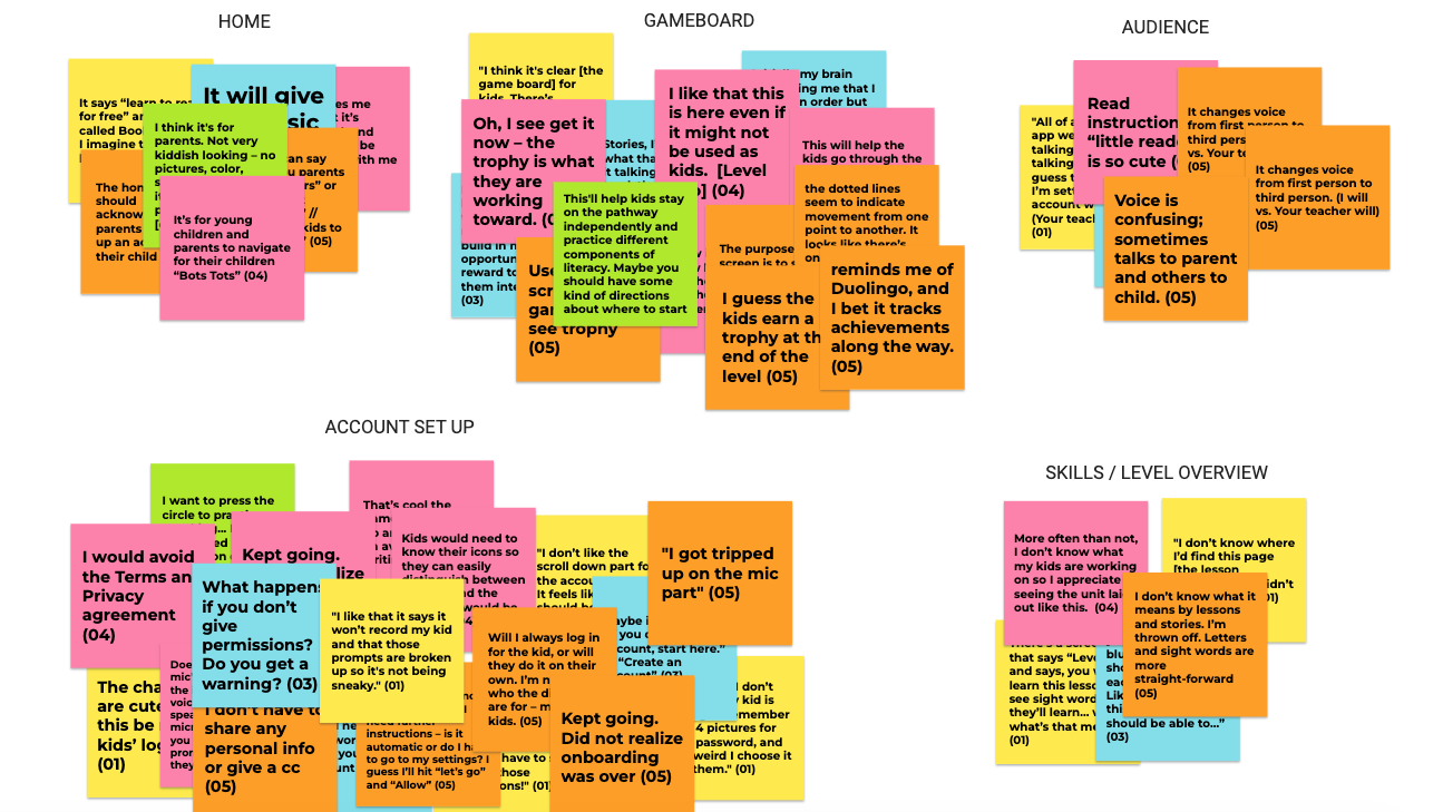
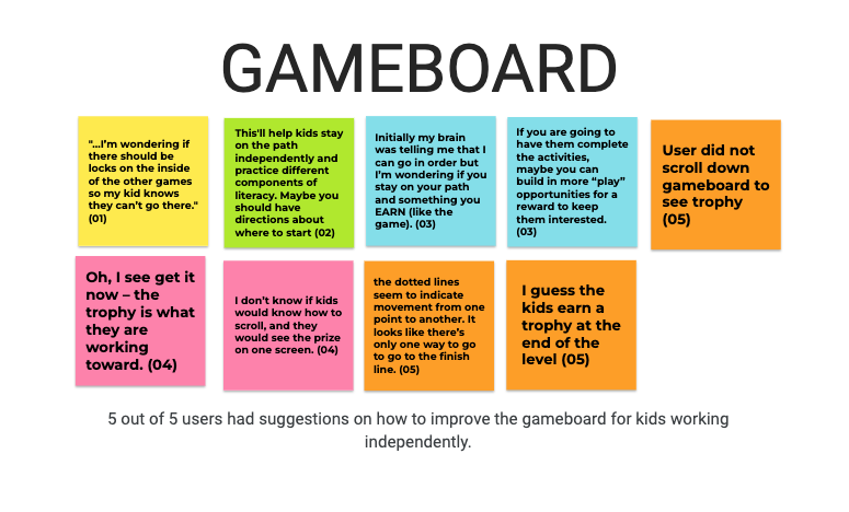
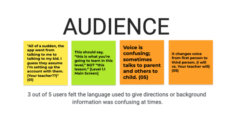
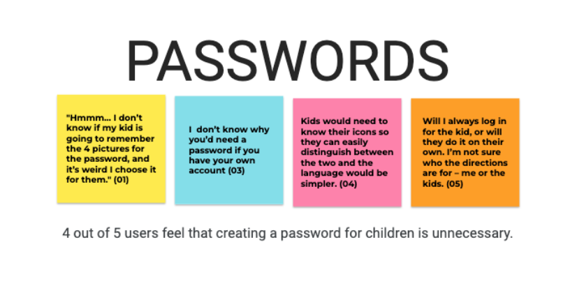
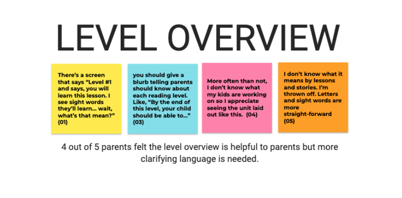
Affinity Diagramming Usability Testing Results
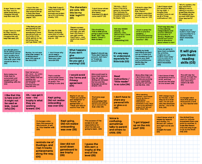
The following patterns or themes emerged from affinity mapping after several iterations: home screen, game board, audience, account setup, passwords and skills/level overview. Further analysis led me to uncover specific pain and pleasure points experienced by users during testing; recommendations for redesign are based on this evidence (see below).


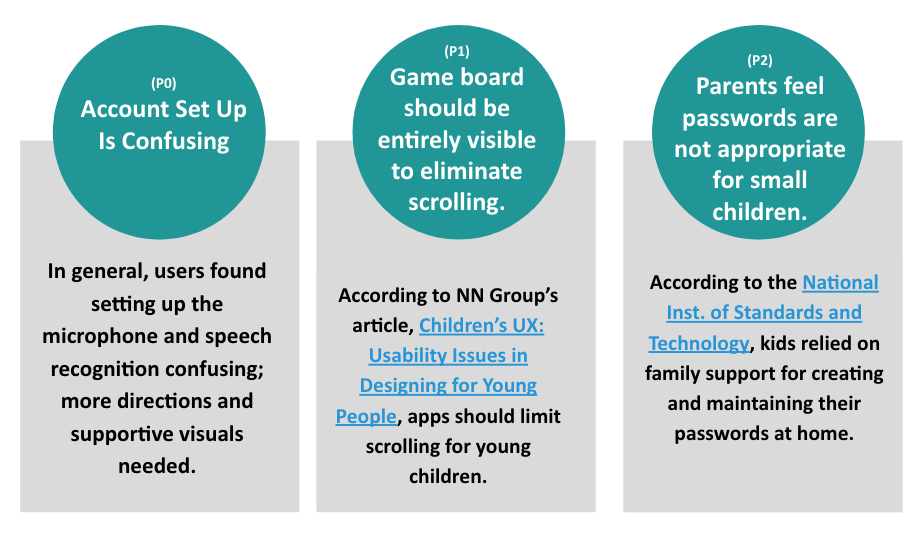
RESEARCH INSIGHTS + RECOMMENDATIONS
A thematic analysis of the SUS results and moderated usability testing yielded the following insights, which I ranked by priority and turned into recommendations for redesign.
THE REDESIGN
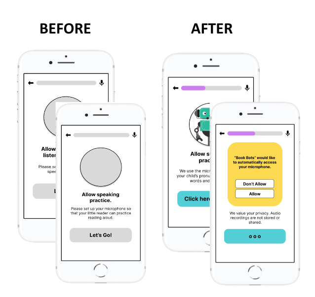
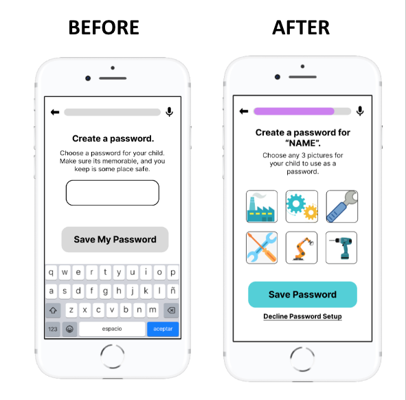
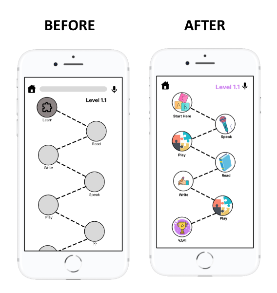
Based on the feedback of user testing, I redesigned the Book Bots mobile app with an easier onboarding process, password setup and reduced scrolling during game play. Overall, these minor improvements helped to improve navigation and user engagement for both the adults and children as you can seek in these before/after shots, and in the high-fidelity prototype, too (below).
Note: Research recommended that even small children have passwords to prevent identity theft if any of their data is being saved. Therefore, the password could not be removed from the designs entirely; instead, I designed a kid-friendly picture password and provided parents with an option to bypass this requirement.

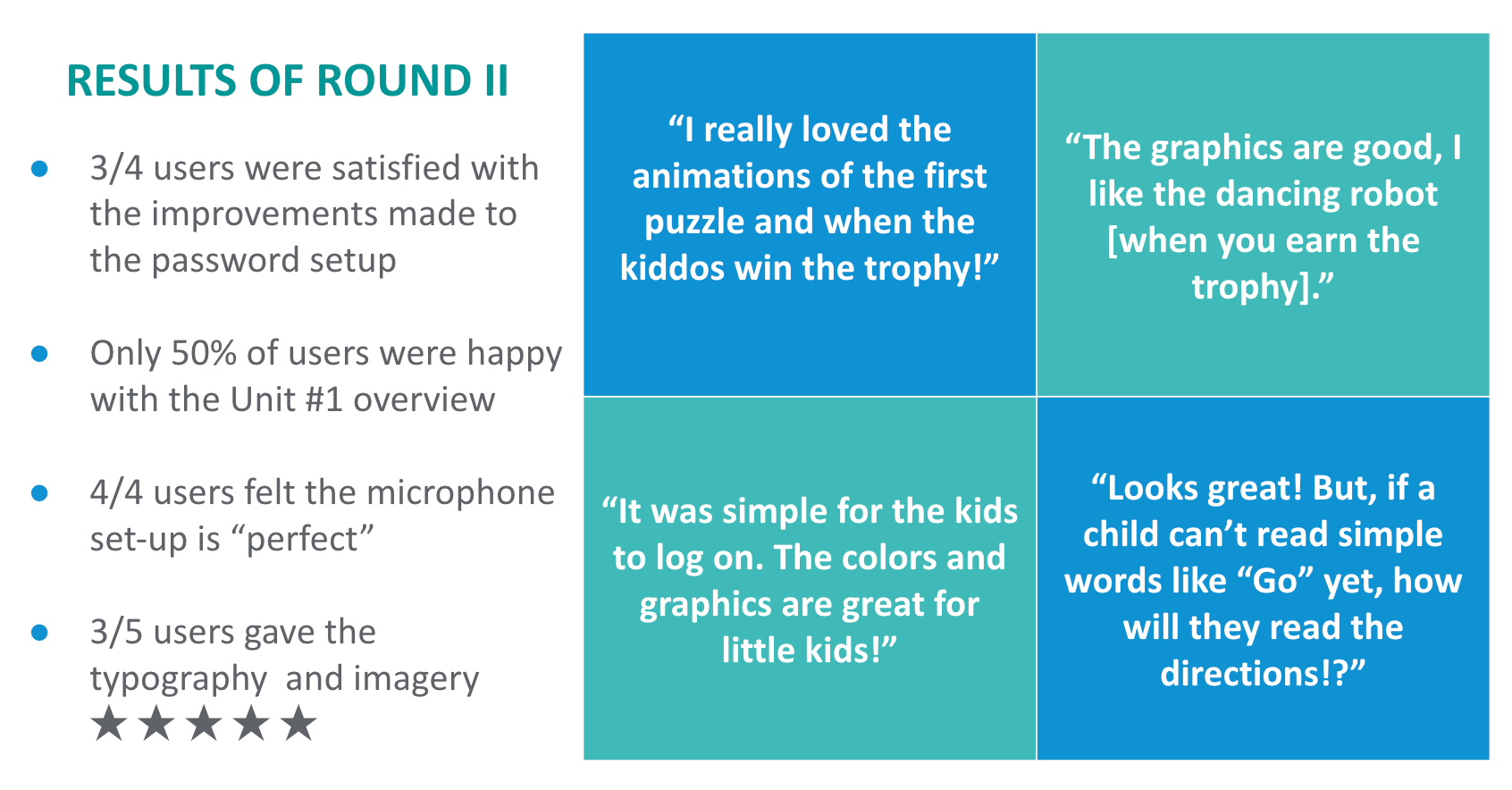
User Testing Results - Round II
I wanted to put the revised designs in front of users, but didn’t have the time to meet with them face-to-face. Instead of conducting usability testings one-on-one, the second user research study was unmoderated. With access to the high-fidelity prototype link in Figma, users completed tasks and answered questions via Qualtrics XM. Here are the results:
RECOMMENDATIONS
Engage children as users to better determine what they want and need, and to improve the overall experience for them.
Add design elements to help children better navigate game play on the app, and make it even more clear how to advance from the first lesson to the final trophy.
Conduct an additional evaluation using Web Content Accessibility Guidelines (WCAG) to consider other ways to accommodate young learners and their parents, including visual and listening supports.
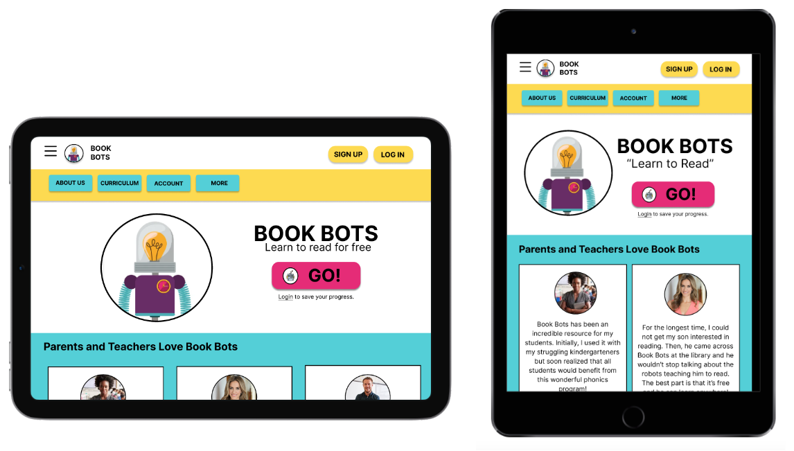
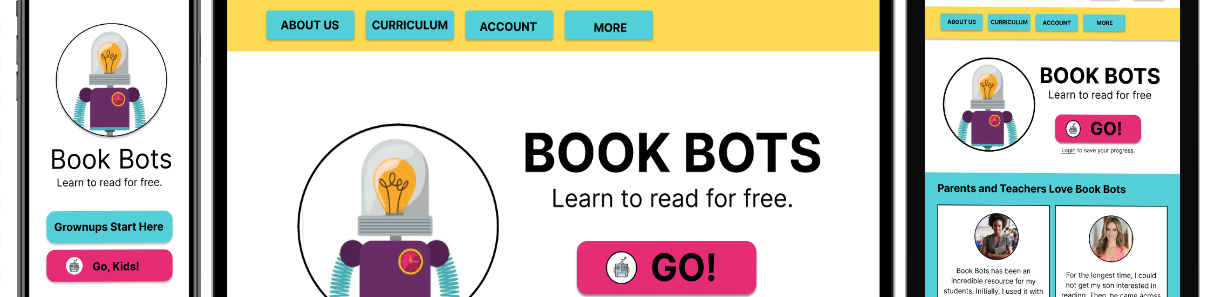
RESPONSIVE DESIGN
With a slightly different use case than the dedicated mobile app, the responsive website is both educational and informative — a place where kids can play and learn, and adults can find out about the teaching methods used by Book Bots. It was really important to have clear information architecture (IA) so that parents/teachers could find what they’re looking for, while also making it obvious to kids where to access learning!
WIREFRAMES + MOCKUPS
Parents and teachers could access BookBots on a dedicated mobile app, a website or on a tablet. The early mockups for the website and tablet showcase the added features, including educational information on Book Bots’ mission and its teaching methodology.
REFLECTION
Without conducting research with children in the target age group (4-7), I wasn’t able to truly empathize with this user group and bring this fictional project to the next step.
With more time and resources, I would love to see this project to its fruition as I’m really passionate about the intersections of learning science, education and technology.